The Pantone colour of 2022 and how to integrate it into your decor
At the beginning of each new year, all textile, design companies and fashion houses eagerly await the release of the Pantone colour of the year.
Indeed, this Pantone-identified colour will help guide the year's trends in several areas, including interior design, graphic design and fashion.
WHAT IS A PANTONE?
A Pantone is a colour identified with a name and a code, determined by the company bearing the same name, Pantone. Pantone charts have been used for decades in the decor and fashion industry and have become a standard for any company working in these sectors. The codes are important tools for the companies wanting to reproduce any of Pantone's colours. For example, if a company decides that it wants to have hoodies printed with its logo, it can tell the clothing manufacturer that it wants its logo in the colour Pantone 2728 C. The manufacturer can then make sure that the printed colour matches the Pantone chart.
In 2021, we were treated to this colour duo, 17-5104 Ultimate Grey and 13-0647 Illuminating. These colours foresaw the difficult year ahead. Grey for resilience and yellow for optimism.

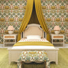
For 2022, Pantone presents us with a bold colour that inspires creativity, Very Peri 17-3938. According to Pantone, "this colour represents the period of transition we are currently in." We are being encouraged to come out of isolation and create with a new perspective on the world. It's also a colour that stands out particularly well on our screens, as Pantone says "our basic notions are forever changed and our physical and digital worlds are more interconnected than ever." [Free translation]

Source: https://www.pantone.com/color-of-the-year-2022
How can we integrate this colour into our decor?
You're probably thinking: how can I integrate this bright, almost fluorescent, colour into my decor? It may seem challenging at first sight, but we invite you to follow these tips and make a place for Very Peri 17-3938 in your home.
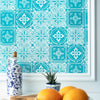
Think accessories
No one says you have to paint your entire room this bright colour. You can have the feel and the look you want by adding some accessories like frames, cushions, a rug or a wall decal.


Tone on tone
For the more courageous among you, dare to experiment with tone on tone. By choosing several textures of the same shade, you will be surprised to find yourself in a retro yet soothing decor.


Different shades
Very Perri is not perfect for you ? No problem ! You can incorporate different shades of purple or colours that are of the same intensity.


One this is clear. This years Pantone colour of the year is telling us to have fun with our home decor projects. The goal is not to have your house on the cover of a magazine but to feel at home in your space. Design your home with you in mind. You can integrate design trends into your home all while respecting your tastes.


